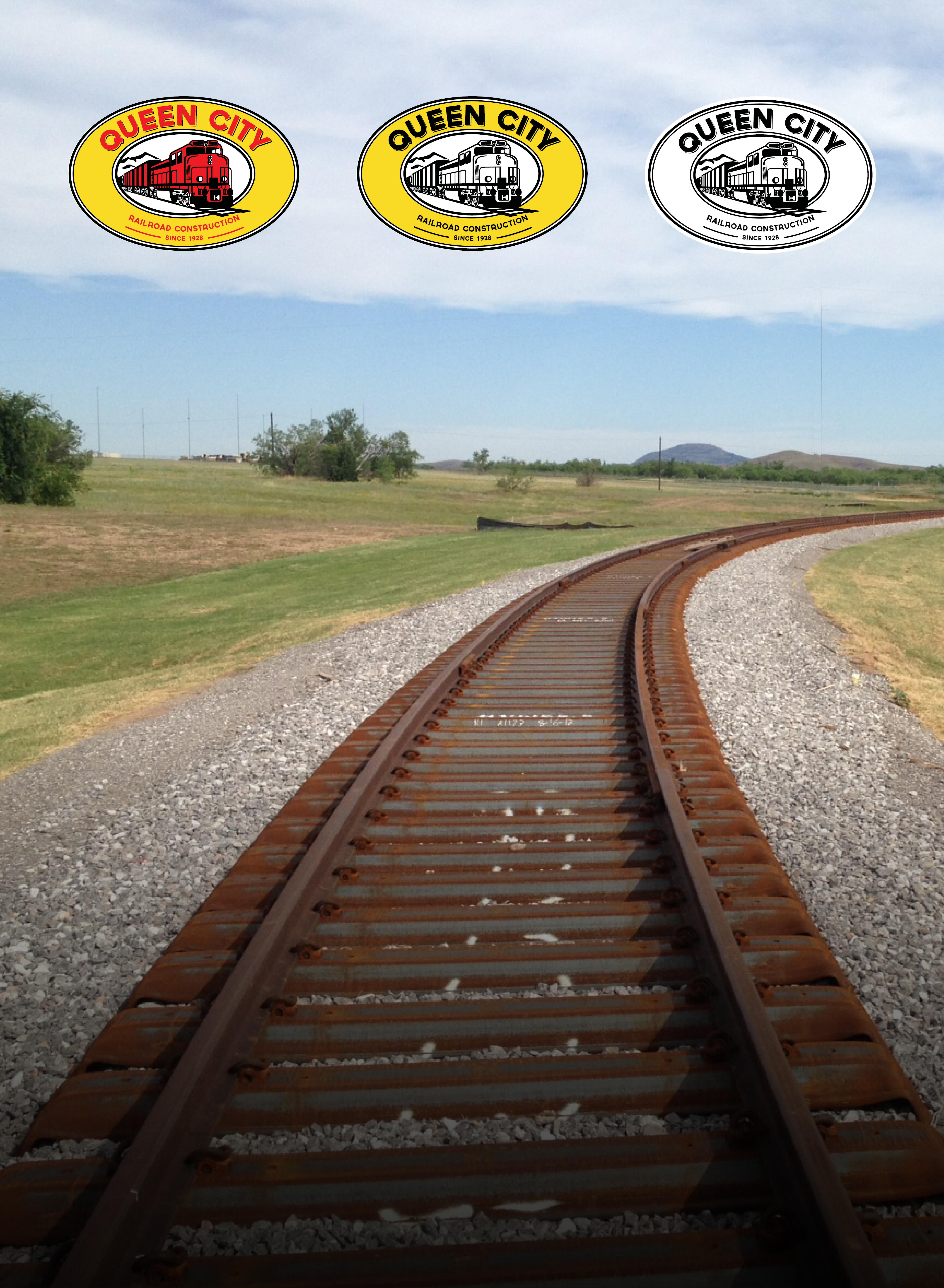
New Queen City Corporate Logo
April, 2016

Queen City Unveils Updated Corporate Logo and Brand Identity
KNOXVILLE, Tennessee – April, 2016
Queen City, one of the nation’s oldest operating railroad construction companies, is introducing an updated brand mark to precede the unveiling of their new website and online presence.
The Queen City corporate logo has been updated with a more contemporary design and distinguished look. The vibrant new logo features brighter colors, bolder fonts and a modern rail train design; which were designed to be multidimensional to better translate into the digital era. The new logo unifies the company’s focus by visually connecting Queen City’s unparalleled level of expertise; rooted in heritage, longevity and a steadfast commitment to quality, with a dedication to impactful growth.
The new logo design features two distinct element updates – the company name with the inception date and a new rail train design. The treatment of the Queen City name is bolder, more dominant and provides greater recognition. The dominant position of the company name; affixed above the inception date, reflects on Queen City’s powerful legacy of serving the rail industry for more than eighty-eight years. The dynamic train load design more accurately reflects on the range of clients Queen City serves; while the new modern rail engine design represents the advancements and transformational changes that both the company and the industry have experienced in recent years. The symbolic use of the forward-looking train represents Queen City’s continued commitment growth in quality rail construction services that enhance rail operations.
“Our updated logo better communicates our strengths, commitment to quality and our forward-thinking approach to rail construction – which is what Queen City has stood for since 1928,” said Mark Edmands, Queen City President. “The new logo serves as a visual representation for the level of quality we pursue and the direction that that we want to take. We believe in the benefits that our client’s rail operations have on the growth and vitality of the economy – and we believe that our updated corporate logo is an expression of the longstanding benefits that Queen City’s contributions offer in the advancement of our nation’s rail infra structure.”
The new logo design represents the fourth evolution of the company mark since its inception in 1928. Queen City partnered with Omaha-based design agency Corporate 3 Design to develop the new corporate logo. The new logo replaces the previous design introduced in 2011 and the preceding original design, which was introduced in the early 1940’s.

About Queen City Railroad Construction, Inc.
Queen City Railroad Construction, Inc., a wholly owned subsidiary of Healey Railsource LLC, is a leader in safety-focused railroad contractor services. Queen City has been serving the rail industry since 1928 and specializes in the construction and management of rail projects of all sizes and complexities. Today, Queen City leverages years of experience to deliver enhanced project expertise and unparalleled quality workmanship to rail projects nationwide. For more information, visit www.qcik.com